More...
617-529-2913
20 Adams Street | Suite 200 | Boston, MA 02129

Insights That Matter

Perspectives on Global Regions, Sectors and Stock Selection Themes – Free Report

The Equity Observer

Facing slowing global economic growth, no inflation, currency market turmoil, and high levels of political tension, the final quarter of 2015 poses unique challenges for today’s investors. Regardless, among these significant market risks and question marks, opportunities are available in many market sectors and geographic regions for savvy equity investors.

In this month’s free report, we examine equity performance in the U.S., Asia, Europe and Latin America as well as various industrial sectors throughout 2015 as a whole and in recent weeks. We provide insight into stock selection opportunities and analyze the key issues facing equity investors in the coming year. Most importantly, we breakdown the implications of these factors and provide recommendations on equity portfolio positioning strategies.

Enter your email address below to receive this free report instantly. 


Perspectives On Potential Asset Class Returns, Risks and Portfolio Positioning – Free Report

After years of consistent growth and above average market returns, mid-2015 has brought a return to volatility raising new levels of investor fear not witnessed since the financial crisis. Is this volatility here to stay? Is this the calm before the storm? How should investors react to this new market turmoil?

The Asset Allocation Advisor - PreviewIn this month’s report, we offer the latest research on the potential risks and returns of various asset classes including bonds, stocks, real estate and commodities. We also break down the risk profile of various multi-asset strategies including macro-economic factors.  Assessing the level and source of risk is key in understanding portfolio positioning. Using this framework, we then provide options for portfolio diversification based upon investor goals and time horizons using our signature Global Focus Capital multi-asset class approach.

Enter your email address below to download this free report.


Getting All Technical – Should We Be Alarmed?

graphThe term technical analysis conjures up lots of strong emotions in people. Some love it and rely on it exclusively for their investment decisions. Others despise it and won’t touch it with a ten foot pole.  Yet others use it as part of their overall investment strategy.

There is probably no greater disconnect in finance as that between people that believe in technical analysis and those schooled in more traditional methods of analysis. While technical analysis takes many shapes and forms probably the most common expression of technical analysis involves trend following.

Basically the idea behind trend following is that the stronger will continue to get stronger and the weak will continue to grow weaker.  What is left unsaid is that clearly, there is always a point at which “things change” and the revenge of the trend plays out.

While technicians swear by their trend following methodologies even academics employing an arsenal of rigorous statistical tests have corroborated the profit making potential of such strategies.  The “momentum” effect as such trending seeking behavior has become known has even joined the widely accepted Fama/French three factor model (market, value and size) as the fourth identifiable factor.

The most common representation of the momentum factor involves a measure of price persistence such as the last 12 months of total returns.  Many variations on this theme exist including making an allowance for stock risk.  In our various equity strategies at Global Focus Capital we employ momentum factors as part of our list of key market indicators.

Designing a Technical Stage Classification System:

In this note we present an approach that seeks to identify technical stages of a stock behavior based on the relationship among the current price and that of moving averages of varying length. Specifically, in this note we use our intermediate technical stage classification system which employs 50 and 200 day moving averages in relation to the current price.  We use our classification system to better understand the price behavior of individual stocks and also as a way to distill information about the positioning of the overall equity market.

Without going into all the construction details, essentially what our technical stage classification does is allocate each stock into one of six buckets as shown in Diagram 1.  The idea is that the average stock moves clockwise and cycles through the various technical stages. The stage in which a stock resides can imply significantly different return expectations.

The “glamor” bucket is the Up Trend Stage where the current price exceeds the 50 and 200 day moving averages and the 50 day average is higher than the 200 day average.  Visually, the price chart on this stock would show a relatively steady rising price.  Under normal market conditions stocks in the Up Trend stage perform the best.  The exception is in periods immediately following big market declines.

On the other end of the spectrum resides the Down Trend Stage.  Stocks in this group are frequently referred to as “dogs”.  The current price is trending down below the 50 and 200 day moving averages and the price decline is accelerating.  Portfolio managers hate owning these stocks unless they can spot a catalyst (usually valuation driven) that within a reasonable time period would jump-start a price recovery. Some of the future stock home runs reside in the Down Trend Stage but, on average, stocks in this bucket perform the worst within our universe.

Diagram 1

Technical Stage Graph

Beside the Up and Down Trend Classifications what else is there?

Contiguous to either extreme lie a couple of technical stages manifesting different levels of improvement or deterioration.  Let’s start from the bottom and work our way clockwise.   When a stock sits in the Down Trend Stage and its stock price starts slowly improving (current price above its 50 day moving average) our classification system would place that stock in the Improving Stage.

If the stock price continues appreciating but with some recent setbacks where the current price surpasses both moving averages then the stock would fall in the Break Out Stage.

In both of these zones there is still some hesitancy to describe the behavior as fully trending but sentiment toward stocks in these stages is clearly on the rise. Under normal market conditions both the Improving and Break Out Stages enjoy above-average rates of return.

In both of these early momentum stages investors have started sniffing around and possibly initiating small exposures.  Deep value investors that typically enter into a stock position when in the Down Trend Stage are most likely seeing portions of their thesis pan out and hence the stock price is appreciating.

Moving through the Up Trend Stage we find the Deteriorating and Break Down Stages.  Basically what is happening here is that the stock has started losing its mojo first in a small way and later on in a major way.  Sentiment has started turning on the stock.

In the Deteriorating Stage the current price has fallen behind the 50 day moving average while still exceeding the longer-term moving average of 200 days. The 50 day average also exceeds the 200 day average. Cracks are emerging and investors are no longer in a blissful state.

In the Break Down Stage the situation is more dire. Now the current price is below both the shorter and longer moving averages. The 50 day moving average is, however, still above the 200 day average.

To provide additional context Table 1 shows three large stocks by market capitalization fitting each one of our technical stages. In addition we present the current proportions of stocks in our global universe in each of the classifications along with the long-term average proportions.

Table 1

Break Down Stage Chart


How does the current Technical Stage Classification configuration compare to History and are there any Market-wide Implications?

The percentages shown in Table 1 correspond to the current technical stage breakdown for our global equity universe of approximately 14000 securities. For example, we currently classify 29% of our stocks in the Up Trend and 24% in the Down Trend Stage.

These percentages reflect the internal state of equity markets. During a raging bull market a large percentage of stocks will naturally sit in the Up Trend Stage.  During the early stages of a nascent bull market there will be a large number of stocks migrating from the Down Trend Stage to the Improving and Break Out categories.

Similarly, as the breath of global equity markets thins out toward the tail end of a bull market the proportion of stocks migrating from the Up Trend category to the Deteriorating and Break Down groups grows over time.

Conversely, when the overall market is in a bear market such as during the 2008/2009 period an increasing percentage of stocks will naturally reside in the Down Trend Stage and as the broad market recovers the proportion of stocks moving to the Improving and Break Out stages should increase.

In normal type of markets most stocks will reside in the extremes of Up Trend and Down Trend with smaller proportions in the four other stages. In Figure 1 we highlight the differences for each stage relative to their long-term average.

Figure 1

Deviation from Long Term Average Proportions

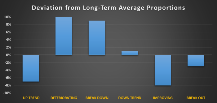
The bull market we have been in post Financial Crisis is clearly losing steam

The first clue is the lower than historical proportion of companies are in the Up Trend Stage (7% below the 25 year average).  Another hint of a change in market tone is given by the significantly higher than average proportion of stocks in the Deteriorating (+10%) and Break Down (+9%) phases.

Focusing only on the glamor Up Trend stocks we have seen a significant downward migration from the beginning of the year.

Figure 2 shows the current technical stage classification for those stocks in the Up Trend stage at the beginning of the year.  Typically, during a bull market about 50% of the stocks in the Up Trend category remain in the same bucket (we refer to this as the status quo effect).

Where are yesterday’s winners? Currently the percentage of repeating Up Trend stocks (from the beginning of the year) stands at 33%., a significant drop from the 50% expected repeat rate.  Moreover, a large percentage of these UP Trend stocks have migrated to the Deteriorating stage indicating a loss of price momentum.

Figure 2

Migration of Beg of Year Up Trend Stocks

Are we headed toward a large equity market correction?

The about average proportion of companies in the Down Trend Stage does not indicate that a large correction is imminent at least from a technical standpoint.  Typically, during the last leg of a long-running bull market what you see is a narrowing market with only a few stalwarts carrying the momentum torch. Normally we would be seeing a larger proportion of companies already in the Down Trend category.

What we are seeing in the technical data could be best described as a pause and in our view the likelihood of a large correction will be more of a function of fundamentals and valuations. The technical picture should corroborate the fundamental and valuation picture in our opinion not be the driving force behind our view of the health of global equity markets.

So, what might be causing this pause in the global equity markets? Without devolving into a deep dive into valuations let’s just say that current global equity market valuations appear expensive when judged relative to traditional historical norms (meaning multiples such as the Shiller P/E) but inexpensive when adjusted for the current inflation and interest rate environment. In addition, the fundamental growth and profitability outlook is yet another rather important determinant of equity market valuation that sometimes gets lost in all the hoopla over valuations.

In our opinion, the current bull market pause is due to an increase in uncertainty regarding the path of future interest rates, inflation, and profit growth.

Absolute valuations using traditional metrics such as P/E’s have looked stretched for several years already yet equity markets have delivered attractive returns.  Except for a brief period post Financial Crisis the Shiller P/E has, for example, pointed to an overvalued US equity market.  Clearly current valuation multiples will dampen prospective longer-term returns, but in our opinion something else is brewing.

So what has changed recently? For one, we know that the Federal Reserve is committed to raising short-term rates starting this year. Investors have known about this possibility for at least one full year.  But does that mean that rates in the US will immediately revert back to historical averages? We do not think so. In fact, our belief is that we are going to be living in an environment of low nominal and real rates for a long time.

Monetary stimulus is also more than a function of Federal Reserve behavior.  The ECB and the BOJ are still in full stimulus mode.  The Chinese central bank is also pumping additional liquidity into the system.  Monetary policy is implemented locally but its effects are global in reach. As long as the net effect of global monetary policies remains expansionary interest rates will remain anchored to lower than normal levels.

Moreover, the furthest thing from central banker’s minds is inflation.  Commodities appear headed for a severe multi-year bear market and while pockets of economic activity exhibit upward price pressures it seems to us that global economic activity is too subdued to lead to any significant uptick in excess demand to soup up all the slack capacity around the globe. Predictions of rampant inflation are today as rare as a NFL Commissioner Roger Goodell fan in New England!

What does a subdued economic environment mean for profit growth?  The link between economic growth (say GDP) and corporate profitability can be tenuous on a year by year basis, but over the long-term EPS growth and global economic growth are inexorably tied together albeit in an imperfect manner.

So what is happening to growth?  In general GDP growth expectations are being revised marginally down. The World Bank recently lowered their forecast of global growth from 3 to 2.8%. China is clearly slowing down (expected growth of 6.5%) and many other large emerging markets such as Brazil and Russia remain in the doldrums. It is unclear what the lasting effect of the Greece debt resolution is for European growth but in any case one can say that the outlook is definitely more uncertain than at the beginning of the year. Japan despite all the massive stimulus is barely expected to grow in 2015.

That leaves us with the US as the key contributor of global growth with GDP expected to rise 2.9% (according to The Conference Board) this year. But let’s just say that there is some skepticism around this forecast in light of the below expectations Q2 2.3% reading and the sometimes downbeat commentary of cyclically sensitive companies (the most recent example being UPS).

Does this mean that EPS growth will be terrible this year? Not necessarily as the link from GDP to EPS is often noisy in the short-term. Let’s start with Japanese stocks.  The Nikkei 225 is expected to show EPS growth of 15% this year and 10% for 2016.  Not bad given the barely noticeable GDP growth in Japan.

What about Europe? Using the STOXX 600 as the broad barometer for European equities analysts expect to see close to a 9% growth in EPS for this year and 11% for next year.  Again, not too shabby given all the headline news coming out of the continent.  These expectations have remained sticky during the last three months of Greek drama and Chinese upheaval.

Surprisingly, the trouble spot in terms of EPS growth appears to be the US.  While the US economy is expected to have close to normal growth, public company earnings are expected to be uninspiring.

For the S&P 500, as an example, 2015 EPS is expected to grow slightly north of 1% down from the 5% growth rate observed last year.  This number has been revised down in the last quarter from slightly over 2%. Growth in 2016 is expected to jump up to close to 11%, but year-ahead projections typically carry significant upward bias.

What does this all mean for equity market returns?

The current pause in the equity bull market is, in our opinion, a reflection of investor worries about growth.

We do not think that current uncertainty about inflation or interest rates merits a place at the dinner table.  Inflation does not seem to be an issue given all the slack capacity in the world and the likely tightening of monetary policy in the US is mostly offset by the loose money policies of the ECB, BOJ and the Chinese Central Bank.

What about valuations? Equity market valuations are high when measured using traditional metrics such as P/E’s.  However, when adjusted for growth potential, inflation and the cost of money equity markets appear to be reasonably priced.  For example, Professor Aswath Damodoran of NYU using a discounted cash flow methodology arrives at a prospective S&P 500 return of approximately 8%.

We are not advocating ignoring valuations especially when thinking about multi-year equity market expected returns.  But in terms of thinking about today’s markets we do not see valuations providing a strong enough catalyst for a large equity market downdraft.

In our opinion the factor creating the biggest headache for global investors is growth. Specifically, uncertainty about the growth profile of the global economy and by association the profit outlook for global equities.  Our view is that global growth is marginally slower than at the beginning of the year and specifically in terms of EPS growth we see the biggest vulnerability in commodity related sectors.

While interest rate sensitive sectors (mainly utilities, telecom and real estate) remain under pressure given the changing stance of Federal Reserve policy we subscribe to a low interest rate scenario for the foreseeable future.  Granted some of these interest rate sectors have been bid up in the “alternative yield trade” but as we mentioned before we do not think that valuations alone will provide the trigger for an equity market correction.

At Global Focus Capital we remain overweight equities and real estate in our asset allocation strategies despite potential growth hiccups.  In terms of sectors we favor growth-oriented sectors such as Health Care and Technology as well as direct beneficiaries of lower commodity prices namely Process Industries.

Eric J. Weigel

Managing Partner

Contact us at Global Focus Capital LLC (info@gf-cap.com) to find out how we can help with your investment needs. Download a PDF version of the report here or sign up below to subscribe to our blog.


Looking Behind the Curtain: Emerging Equity Themes and Surprises – First Half of 2015

CurtainFinancial markets always seem to be in flux and every year brings surprises as well as the confirmation of some emerging themes.  This year is no different as investors have had to battle with a number of issues such as the continued energy complex meltdown, a potential interest rate hike in the US, a weather related slowdown in US economic growth, the strength of the US dollar, the rocket-like ascent and subsequent coming down to earth performance of Chinese equities and most recently the continued travails of the Euro Zone precipitated by the debt crisis in Greece.

In general, most fixed income strategies exhibit year-to-date losses while most equity indices stand in positive return territory.  Non-US developed equities in particular have performed well.  Small caps have also out-performed globally.  Interest sensitive assets such as REITS and higher yielding equity segments have under-performed while commodities continue in the doldrums. Investors shying away from commodity and interest sensitive sectors as well as those willing to hold significant international equity exposure have been rewarded thus far in 2015.

Major broad equity market indices tell a fairly benign story thus far in 2015. Volatility has been low and the hiccups when they have come have been short-lived and muted.

Just like watching a live play hides the beehive of activity going on backstage, broad indices often obfuscate the myriad of developments and emerging themes shaping up in smaller pockets of the global equity markets

Let us take a closer look at global equity market performance thus far in 2015.  Our universe is comprised of over 14000 stocks distributed over 50 plus markets.  As you can imagine, in such a large universe we will have spectacular successes as well as failures and we, therefore, rely on median local currency returns as our barometer for performance.

Return averages are too subject to outliers and medians, while simplistic at first blush, give us a reasonable sense of performance across countries, economic sectors and investment characteristics.

We also choose to focus our analysis on local currency median returns as we believe that mixing currency and local stock performance (putting everything in, say, US dollars) can sometimes lead to erroneous inferences regarding the strength of certain trends.

Suffice it to say that this year the vast majority of major currencies have depreciated versus the USD resulting in lower equity returns to non-US strategies from a US-based investor perspective.

For our sample of global equities the median local currency return stood at 8.9% through July 3, 2015.  The average return (once we trim obvious outliers) came in at 13.5% denoting some positive skewness in the return data.  The median USD-denominated return for our sample was 6.7% highlighting the first half strength of the currency.

Drilling Down By Geography:

Let us start by drilling down by geography as shown in Figure 1.  The first thing to notice is that very few markets (Colombia, Greece, Indonesia, Mexico, Peru and Taiwan) have had negative median returns this year.

Second, some lesser travelled markets such as Argentina, China, Czech Republic, Hungary and Russia have thus far excelled in 2015 with median local currency returns north of 20%.  Other notable performers typically in the wheelhouse of global investors include Denmark, Italy and South Korea.

Figure 1

Media Local Currency Stock Returns


If you are having trouble finding the US that is because the median US stock has had a paltry 2% return in H1.  Nothing to write home about compared to most other global equity markets.

What about all the fuss regarding the rebirth of Japanese stocks? To me it still seems justified given the 13% median return to Japanese equities in 2015.  In fact, the larger international markets have all outperformed the US with median returns several orders of magnitude larger (UK stocks are up 9%, German and French stocks are up 15%).

A Further Look by Economic Sector:

A look at median returns broken down by economic sector (Figure 2) reveals the continued struggles of the more commodity and interest rate sensitive segments.  The only sector in the red for 2015 is Energy while the Non-Energy Minerals aggregate is barely positive for the year.

Commodity exposure continues to be shunned by investors living in today’s low inflation environment.  Interest sensitive sectors such as Utilities and Telecom have also suffered from the upward drift in yields (especially in Q2) and the perception that a sequence of interest rate hikes by the Federal Reserve and possibly the Bank of England are just round the corner.

On the positive side, the growth oriented sectors have had superior performance in 2015.  Anything related to information (primarily software) and health care technology has done well this year.

On a surprising note has been the performance of the Process Industries sector (this includes primarily Chemical companies with a smaller representation of Paper and Food).  These industries are the direct beneficiaries of lower commodity prices (their production input) but in all fairness as we dug through the sector we found a high proportion of smaller cap rocket stocks in countries such as China, South Korea and Germany.

Figure 2

Median Local Currency Returns


One Last Peek – A Bottom-Up Stock Perspective:

Country and sector affiliations have historically been key drivers of stock performance but stock selection has typically been where most of the action takes place.  Some of that stock specific contribution is clearly random while another piece of the pie is driven by the bottom-up characteristics of the stock.   These characteristics are sometimes referred to as styles (for example growth or value) and at other times as factors. Yet another set of terminology has emerged in the last few years as the industry has re-labelled several of these stock characteristics as “smart” beta.

For purposes of evaluating stock characteristic performance we employ the same universe of global stocks used previously.  However, instead of aggregating stocks by geography and sector we create membership buckets (with data as of year-end 2014) according to the value of the characteristic in question.  For example, we split our entire sample into 10 buckets (Deciles) according to the price to earnings ratio of stocks ranking them from low (Most Attractive) to high (Least Attractive).  Decile 1 thereby contains the most inexpensive stocks in our sample. We proceed to create analogous deciles for a range of stock characteristics typically employed by fundamental and structured portfolio managers alike.

We categorize our stock characteristics into the fundamental concepts of valuation, growth, profitability, income generation, and capital structure. We supplement these fundamental drivers with analyst and investor sentiment along with two “smart” beta factors (low volatility and market capitalization).

Table 1 outlines the specific stock characteristics we analyzed as well as the rationale behind their selection while Figure 3 highlights the spread in local currency median returns between the top three deciles (Most Attractive) and the bottom three deciles (Least Attractive).

Table 1

Table 1 Groups Chart


If the market behaves according to conventional wisdom (as outlined in the table) the spread in performance should be positive. For example, if we believe that cheaper stocks outperform expensive stocks then the return spread should be positive.  All factors have been aligned so that Decile 1 contains the most attractive stocks and conversely Decile 10 contains the least attractive members.

A quick glance at Figure 3 confirms that the real world of global equity investing is frequently messy.  The good news is that a significant number of our stock characteristics led to performance spreads in the right direction (recall that our expectation is that all the bars in Figure 3 should be positive).

The reality of global equity markets during the first half of 2015 was, however, not kind to valuation approaches as shown by the mostly negative spreads. Take a look at the leftmost bar which corresponds to the spread in performance between the cheapest and most expensive stocks in terms of price to earnings ratios (PE). The return spreads is -4% meaning that the strategy of buying low PE stocks and going short high PE stocks would have cost you 4% thus far in 2015.  The only valuation indicators with a positive return spread were Price to Sales (PS), Enterprise Value to Sales and the PEG ratio (growth adjusted PE).

Companies reducing their share counts the most underperformed (SHARES_OUT) during H1 2015 as did lower volatility stocks (VOLAT).  In addition, the momentum effect (TRY1_LOC) was very strong during the first half of the year.  The momentum spread was over 9% and the relationship was monotonic across all deciles. The top decile for momentum had a median return of 15.5% while the bottom decile yielded a median return of just 1.6%.

In terms of market capitalization small caps widely trounced large caps as shown by the over 8% median return spread.  Most of the outperformance of small caps was driven by the smallest group of companies (Decile 1) which were up a median return of 29%.  Active equity managers tend to frequently possess a capitalization bias (favoring smaller caps) that should have proven rewarding thus far in 2015.

Figure 3

Return Spread


The search for income (DY) was not particularly fruitful in our sample of global equities.  The return spread between the highest yielding stocks and non-payers was close to -4%.  The effect was fairly monotonic indicating that the market place rewarded investors de-emphasizing the income component in their stock selection.  The widely anticipated interest rate increases in Q2 derailed the competitive advantages of dividend paying stocks (relative to say bonds) and most likely have sensitized investors to the dangers of chasing yield at the exclusion of other desirable stock characteristics.

Interestingly, stocks with lower current debt burdens (DEBT_EBITDA) outperformed their more indebted peers possibly reflecting investor unease with a scenario of rising rates.  The real effect of rate rises on company financial health is a function of many variables including the maturity schedule of the debt.  My sense is that most savvy company managements have been eagerly extending their debt maturities at the still very attractive real rates prevailing globally. I would not expect this factor to play a major role in stock selection over the next year or so unless, of course, we dive into a global recession.

Sell-side analysts have been rewarded this year in their stock picks. While the relationship between mean analyst ratings (REC) and median stock performance is not perfectly linear (there is a bump in the middle of the distribution) analyst recommendations have proven money winners this year.  This follows a generally sub-par 2014 when their mean predictions were generally un-informative.

Growth-oriented investors have enjoyed favorable global equity market developments.  Most profitability measures have proven valuable as stock picking strategies(especially Return on Capital) but the real boost has come from the performance of stocks exhibiting superior growth characteristics (in terms of EPS, Sales, Cash Flow and Dividends). All the return spreads for the growth-oriented factors as shown in Figure 3 are positive and large.

High Level Summary of Research Findings:

  • Value-oriented approaches have worked perversely thus far in 2015. Expensive stocks have outperformed their more inexpensive brethren.  Low volatility stocks have also under-performed along with dividend paying stocks.
  • Growth oriented factors along with momentum and market capitalization have provided the greatest median return discrimination within our global stock universe
  • From a top-down perspective the surprise has been the strong performance of some of the smaller less-travelled equity markets
  • The median return to US stocks stood at 2.2% significantly lagging the median local currency returns of other major equity markets
  • In terms of economic sector median stock performance we continue to see both commodity and interest rate sensitive sectors underperform.
  • Stocks in growth oriented sectors such as Health Care and Technology, on the other hand, continue to perform well in the first half of 2015

Turning Research into Insights – Finding Fundamental Themes  

A big part of the challenge facing investors is turning the vast array of top-down as well as bottom-up data into money making insights. With markets always on the go and the extreme amount of noise facing investors it is tempting to adopt a purely passive approach.

A more fruitful approach might, however, be to become more discriminating about separating  the everyday noise in the markets and focus instead on finding a small number of themes with a high probability of lasting power and money making potential.

Themes can be micro or macro-based.  A good example of a micro theme might be the emergence of “Big Data” as an investment concept. Another one might be mobile device security.  Micro themes can be especially lucrative early on but at inception suffer from a dearth of publicly available investment options.

Grass-roots fundamental research is often the only way to unearth these opportunities until they enter the mindset of Wall Street firms.  Micro-themes can still remain highly profitable after their discovery by the broad investment community, but gradually expectations exceed reality and the opportunity is subject to over-pricing.

Macro themes on the other hand are more general in nature and tend to have a longer life span.  There are usually a myriad of liquid investment options available to capitalize on the theme.  Macro themes are usually commented in the press and their knowledge among investors is widespread. A representative macro theme might be the re-emergence of global inflation.  Another macro theme might involve the breakup of the Euro.

There is usually a wide divergence of opinion when discussing macro themes. Opinion differences might revolve around the likelihood of the theme happening and its timing.  In addition, the impact of the theme on capital market prices might be subject to debate.

While at any time there are usually a large number of themes circulating among investors, our preference is to focus on a small number of themes that based on our research have a reasonable probability of both occurring as well as being impactful to asset prices.  We also strive to find common findings among our top-down and bottom-up research that further lend support to the theme.

Some of the themes that Global Focus Capital is trying to capitalize on fitting our research criteria include:

  • The growing gap between supply and demand in the global energy market leading to continued downward price pressures
  • The breakdown of the alternative yield trade as investors learn to pay attention to the associated risks and exposures of their strategies
  • The shrinking profit pie and the search for secular growth investments only marginally influenced by business cycle conditions
  • The volatility dampening effects of highly expansionary monetary policy leading to an under-appreciation of longer term risks and potential over-leveraging
  • The re-awakening of investors to global economic growth imbalances leading to periods of risk on/off in capital markets

Eric J. Weigel – Managing Partner

Feel free to contact us at Global Focus Capital LLC (info@gf-cap.com) to find out how we can help with your investment needs. Download PDF version of report. 

To receive valuable reports like this by email, sign up below!


Feeling Risky? First Check the Mood of Those Around You!

coupleFinancial markets frequently feel like the morning commute on a major city subway system. When the weather is sunny and the trains are running smoothly you are all smiles and your mood is upbeat. But, watch out if you are experiencing weather delays and personal space is compromised. Your mood and that of your fellow travelers darkens considerably and your thoughts switch immediately to how to escape the situation.

Investors likewise frequently feel this tug of war between one moment being upbeat and confident and the next being rife with doubt and stress. Back in 2009 Mohamed El-Erian then at Pimco described the changing mood swings of investors using the risk on/risk off label.

While the risk on/off concept makes a lot of sense to truly grasp the investment implications of such mood swings one needs an objective yardstick to properly identify these periods of euphoria and sheer despair.

Most of the methodologies that researchers have used to identify investor mood swings employ measures of general uncertainty regarding asset class prospective performance, credit conditions and broad macro-economic health.

The technical details separating one system from the other would put most investors to sleep, but in general my observation is that all these “investor mood” models are directionally correlated. For example, the period 2004-2006 is generally classified as upbeat while the period from 2008 through 2009 is generally described as harrowing.

At Global Focus Capital we call our proprietary system the Risk Aversion Index (RAI). The higher the RAI the more fearful investor are, or in other words the more risk averse. We calculate this measure daily and sometimes, given the rapid mood swings, we have come to think of market participants as suffering from multiple personality disorder. However, on a kinder note what we generally observe is that investor mood tends to reside, over the intermediate-term, in defined ranges of risk aversion.

Let me illustrate what I mean by referring to Figure 1. The first thing to notice is the choppiness of the Risk Aversion Index (grey area). This clearly provides empirical support to the concept of risk on/off. Investor mood is highly volatile and switches sometimes rapidly from euphoria to despair.

The second thing to notice is the tendency over intermediate time periods to remain in a defined range of risk aversion zones. We use a 200 day moving average to smooth out the daily ups and downs and better visually this clustering effect. While investor moods are ever changing, in general, we see long periods of time when investors are much more tolerant of risk and similarly other periods when investors crave above all else for the safety of their capital.

Figure 1

RAI Time Series


Let me elaborate further. For simplicity we classify our RAI readings into three risk zones – a Risk Loving Zone (defined as the bottom 25th percentile of observations) where investors are usually dismissive of potential adverse developments and are willing to accept less return per unit of risk. The period 2013-2014 accurately describes this low risk aversion environment. Many observers would attribute this indifference to risk as a function of the very loose monetary policy of the day. Similarly the years before the 2008 Financial Crisis exhibited a strong downward trend in risk aversion.

The second zone (middle 50% of observations) labelled the Neutral Zone is the area where investors some days feel good and on others feel a bit down but in general there is a healthy balance between risk and potential return. This middle zone is one where investment strategy is preferably based on longer-term fundamentals and less influenced by the prevailing capital market risk environment.

Finally, we define a Risk Allergic Zone (top 25% of observations) where gloom and doom is the order of the day. The periods surrounding the bursting of the Tech Bubble and the Financial Crisis of 2008-2009 best illustrate occurrences when investors suffered from such a high aversion toward risk.

What does it mean to be in each one of these risk zones? Without going into all the portfolio construction issues (which we will explore in a separate note) let us just focus on returns.

In Figure 2 we illustrate average monthly returns since 1995 for the major asset classes typically part of our asset allocation strategies at Global Focus Capital. Among equities and fixed income we split the asset classes into domestic and international and also always include alternatives such as real estate and commodities.

Figure 2

avg_ret_risk_scores (1)

Periods of capital market stress such as those when the RAI is in the Risk Allergic Zone (red bars) are difficult for investors holding riskier asset classes such as equities. In line with conventional wisdom the higher the perceived risk the more negative the average returns. When the RAI is in this zone all equities suffer but emerging markets takes the biggest hit (down 2.3% on average). Our two alternatives (Real Estate and Commodities) also take a hit but the overall negative effect is dampened due to their exposure to non-equity risk factors.

Fixed income on the other hand tends to exhibit positive average returns during this high risk aversion phase. In fact, the highest average returns of all asset classes correspond to government bonds (US and Non-US developed market). US Government bonds for example show an average monthly return of 1% in the Risk Allergic Zone.

Let’s see what happens when the RAI falls in the Risk Loving Zone (green bars). Here the situation is reversed. Asset classes with higher perceived risk tend to do better. Emerging market equities do best on average and small caps outperform large cap stocks. Real estate also does well. Within fixed income emerging market bonds do best, but in general the performance of safer assets lags significantly behind that of riskier investments.

When in the Risk Loving Zone it pays to be aggressive, but one must also be mindful of taking on too much risk in exchange for less and less potential reward. Both the Long Term Capital Management implosion in 1998 and the 2008 Financial Crisis debacles occurred on the heels of investors being highly dismissive of the risks involved. In both cases investors were taking on a disproportionate amount of risk for smaller amounts of potential return.

Finally when evaluating returns in the Neutral Zone (orange bars) it is interesting to note that, on average, equities tend to exhibit the best monthly returns when in this risk phase. All four equity classes show this tendency. Likewise real estate also shows the highest average returns in the Neutral Zone. Interestingly, the highest perceived risk asset within fixed income – Emerging Market Debt – also shows this characteristic.

Where is the RAI now and what should we be doing? Our barometer is currently entrenched in the Risk Loving Zone with a reading in the 20th percentile. The RAI has been trending up (becoming a bit more aware of risk) but despite headaches in Europe we are still seeing very low levels of risk aversion.

We suspect that the expansionary monetary policy in the US, Japan and Europe is artificially depressing capital market volatility and that the temptation to remain aggressive (and potentially take on leverage) is driven by the exceptionally low cost of money. We remain wary of too good of a thing and the quietness of the capital markets concern us. We believe that investment performance is most aligned with fundamental trends when investors display a healthy risk to return relationship such as when in the Neutral Zone.

What could trigger a change in investor mood? Potentially a whole host of issues frequently best understood in hindsight. But on a more practical note we would highlight two areas of concern. First, while highly anticipated, we think that investors will react negatively to the first increase in the Federal Funds Rate and risk aversion will jump up sharply. The second concern involves contagion effects should a Greek default occur. At the very least the interest spread between safe and riskier debt should jump up. This would lead to a higher RAI and riskier investments will likely bear the brunt.

On a final note, we believe that investment risk is being underpriced at the moment and that there is no better time to evaluate one’s willingness to trade off risk in relation to potential reward. Monetary authorities have provided investors with a nice safety cushion and allowed aggressive investors to benefit disproportionally, but the ride is nearing an end at least in the US.

Eric J. Weigel

Managing Partner

Feel free to contact us at Global Focus Capital LLC (info@gf-cap.com) to find out how we can help with your investment needs. You can also download this report in PDF format or sign up to receive future ones by email below.


Worried About Your Investments?

Three Things You Can Do To Lessen Your Fears

Man Worried About InvestmentsAfter the harrowing experience of the 2008 Financial Crisis investors have acquired a heightened sensitivity to market dips.  While global economies have for the most part recovered, trouble spots still loom on the horizon and global macro-economic conditions remain frail in the eyes of most investors.  Investors have benefitted from the recovery of equity and fixed income markets, but market participants now fret about over-valued conditions and a lack of yield.

In general, on the surface there is an uneasy sense of calm prevailing in the markets, but anecdotal evidence points to a general climate of investor nervousness.

While the timing and severity of market meltdowns is impossible to forecast with any reasonable degree of accuracy, investor can take action to better prepare themselves for the inevitable turbulence ahead.

One option is to Review Your Strategic Asset Allocation Plan:  The first and most important action that investors can take is to thoroughly evaluate their total investment portfolio in relation to their goals and risk appetite.  Large institutional investors such as pension plans regularly conduct strategic asset allocation reviews that determine broad asset class exposures and appropriate risk levels in relation to a plan’s stated goals and ability to withstand capital market shocks.

Individual investors are no different from large institutions in the need to regularly assess if their portfolios are structured in a manner consistent with their current goals and their stomach for sudden losses in capital. As Yogi Berra once said “if you don’t know where you are going, you will end someplace else”.

Knowing what you want and how much pain you are willing to incur is the starting point for structuring an investment program that removes worry and deals with what is in your control.  The day to day vicissitudes of the capital markets are beyond anybody’s control so action item one is to strategically look at your portfolio for its fit with your goals and willingness to tolerate capital losses. If there is a good fit you have done everything within your control.

In the short term, nothing guarantees against disappointing outcomes, but over the long-term capital markets tend to exhibit certain tendencies such as stocks outperforming bonds but with more interim volatility, credit strategies outperforming government bonds again with more volatility, and money market investments being the safest but lowest yielding asset class.  A well designed strategic plan should allow the investor to lessen their fears and only make adjustment as circumstances change.

Another course of action is to Buy Protection on Your Portfolio:  Just like people buy insurance policies to protect them financially against adverse events such as a house fire, a flood or the death of a parent, investors can structure an insurance plan covering their portfolio. There are many different flavors of insurance available to investors. The type of insurance strategies most commonly used by investors are not contractual in nature and thus do not guarantee a firm floor for the losses.  Instead strategies are designed to “hedge” against severe negative portfolio outcomes on a best efforts basis.

The specific features of the hedging program involve determining the potential maximum expected loss (think deductible), the assets covered, length of coverage, hedging tools employed, and finally the expected cost of the program.  Barring highly unusual capital market conditions, portfolio insurance programs involve a cost to the investor (think premium).

Typical hedging vehicles include exchange traded derivatives on indices.  The strategies could involve buying a put option on the S&P 500 to protect against major adverse equity market developments, or shorting a T-Note futures contract to offset the harmful effects of interest rate increases on a portfolio.  The specific strategy would optimally be calibrated to the investor’s portfolio, but in recent years we have seen the issuance of several inverse ETF’s (see PSQ) and  rules-based products (see PHDG ) designed to provide generic hedging capabilities.

In all cases, the assumption is that there is a negative correlation between the performance of the hedging strategy and the portfolio one is trying to protect.  When the portfolio takes a hit the idea is that the losses would be partially offset by gains on the hedging vehicle.  Portfolio protection programs typically come at a cost and the quality of the protection is highly dependent on the structure of the program and the degree of customization involved.

Finally, Use a Tactical Asset Allocation (TAA) Overlay.  Such an approach is predicated on the ability to identify periods of time when capital markets relationships appear distorted.  The approach involves removing exposure to certain asset classes (the menu typically involves stocks, bonds, cash, real estate, commodities and alternatives) when the likely profits are minimal in relation to the risk taken, and conversely adding exposure to asset categories when, for some reason or another, the risk of doing so is low in relation to the potential reward.

The trigger in most TAA programs for making portfolio shifts are changing expectations for asset class returns. In addition, shifts may also be driven by the changing risk profile of the asset classes as well as the overall risk aversion of capital market participants.

TAA provides portfolio protection by skillfully adjusting the exposures of asset classes in the investor’s portfolio.  Typically, TAA programs work in conjunction with the longer-term plan of the investor by incorporating measured deviations from the set of exposures prescribed by the strategic plan.  The TAA program will, in theory, dampen the short term downside volatility of the overall portfolio while still allowing the investor to enjoy the long-term rewards of the strategic plan.

TAA is a skill-based active approach to portfolio management and as such can offer the dual benefits of enhanced returns (due to the tactical shifts) and lower interim portfolio volatility, but in the absence of skill there will be a cost associated with the activity.  Sometimes the cost will be in terms of missing out on unusually positive returns (if the TAA strategy is positioned too defensively) and at other times the cost will come from incorrectly tilting the portfolio toward asset categories with disappointing performance.

“Thinking will not overcome fear but action will” as W. Clement Stone once said. All three action steps mentioned above will lessen your fears, but the greatest contribution to your financial well-being is forming a strategic asset allocation plan.

Examining your goals and willingness to take risk and structuring your portfolio accordingly is the key action step that will allow you to more confidently navigate through the inevitable market ups and downs.  A solid risk management approach to investing and a tactical ability to adjust to temporary capital market dislocations will enhance only enhance the hard work of planning ahead.


Eric J. Weigel

Managing Partner

Download PDF Version of Report: Worried About Your Investments – Global Focus Capital – June 2015. Feel free to contact us at Global Focus Capital LLC (info@gf-cap.com) to find out how we can help you with your investment needs.

Sign Up For Blog Updates:

Sign Up For Blog Updates:

Is Loving My Smart Beta All That Wrong?

Investors are madly in love with “smart” beta strategies and asset managers offering such products have been shown the love. It was almost inevitable that as active management has gotten a bad rap, investors would flock to the next great thing. Just like in the comedy “If Loving You is Wrong” by Tyler Perry, there is the potential for significant turbulence ahead when falling head over heels in love with these “smart” beta strategies.

In this free report, we’ll look at the different factors that comprise smart beta strategies and why investing based on one factor exclusively may not be the best option available to today’s investor. Click here to download free report: “Is Loving My Smart Beta All That Wrong

Will Ignoring Bonds Help You Sleep At Night?

With interest rates hovering near recent memory lows it is tempting for investors to turn in disgust and ignore the fixed income markets and focus instead an asset classes with more potential for outsized returns such as stocks.

While such a reaction is not unreasonable for an investor with a time horizon measured in decades (after all stocks do tend to outperform bonds over the long-term), for investors with more immediate goals and cash flow needs the inclusion of bonds in their overall asset allocation mix is worth exploring in greater depth.

Download Free Report: Will Ignoring Bonds Help You Sleep At Night – March 2015

1 8 9 10
HTML Snippets Powered By : XYZScripts.com